Closing the gap between visit and value
Redesigning patient onboarding for a genetic testing portal — across provider, patient, and internal tools.
Project
There was an opportunity to drive higher patient kit ordering with the support of providers and our internal team. I worked with a product manager and a set of engineers to empower patient users to complete a genetic kit order through the patient portal.
I designed across three connected surfaces:
- Provider portal used by physicians and clinical staff to order genetic tests
- Patient portal used by patients to create accounts, track status, and view results
- Internal tools that manage orders and results for operations staff.
Goal
Originally we thought there was just a patient onboarding issue, where patients got lost inputting their information to start an account. But upon further investigation, this wasn't just a patient problem, it was a drop-off started with the provider and then lack of product awareness. The hand-off between provider and patient was unclear to the patient how to proceed in their journey.
I designed the experiences so that providers confidently invited patients to the portal, patients created an account and completed an order, and our internal teams could proactively catch all patients that didn't receive their kit.
The problem, in numbers
I worked with a data scientist to understand baseline metrics determining where the funnel was actually breaking.
The overwhelming majority of patients who started this flow never finished it because of information input overload. Providers set up the kit order for the patient, but it was unclear whether the patient had access to or information on the kit status — it was clear that providers were our power users.
Reframing the design problem
Instead of treating this as one onboarding flow to fix, I reframed it as a distinct problem: authentication drop-off. The data showed nearly a quarter of visitors never signed in at all, which suggests the first barrier to entry is the account-creation step. This distinction mattered because it meant the fix wasn't more encouragement to sign up — patients needed support from their providers or Invitae to know if they had an account, only then could they autonomously create a password, log in, and tend to their kit order.
Approach
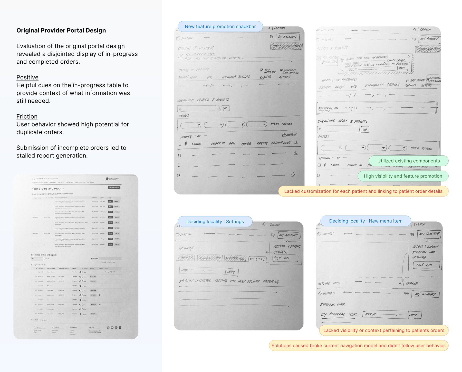
Providers were verbally telling patients about the Invitae test — there was little to no guidance for the patient to find our website and register. We wanted to bridge the gap by intentionally inviting patients to create an account, so there was a seamless hand-off from the order made by the physician in clinic to when the patient sat down at their home computer to access it.
Stage 1 — Provider orders the test
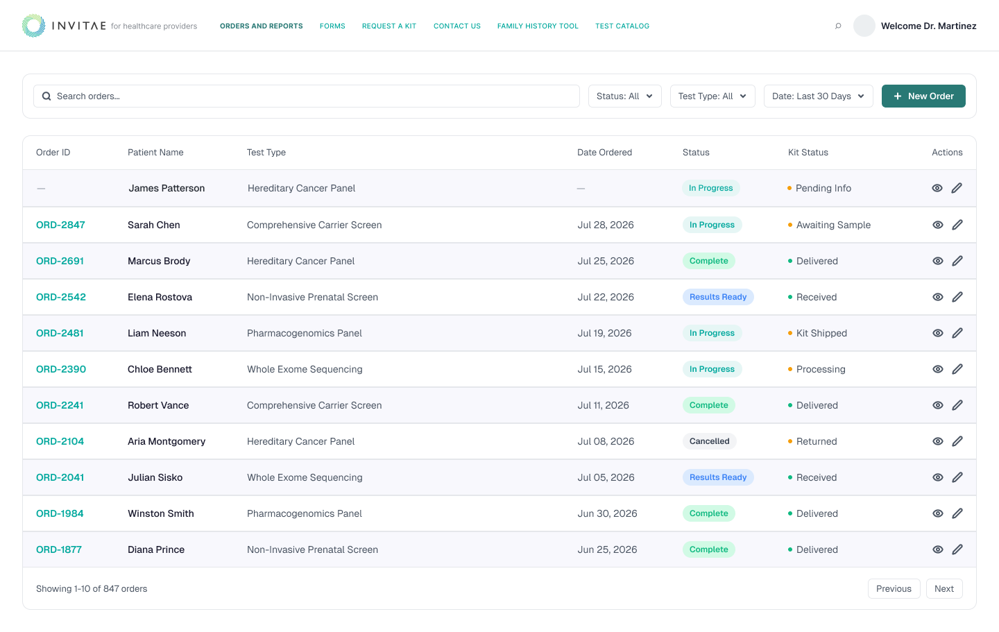
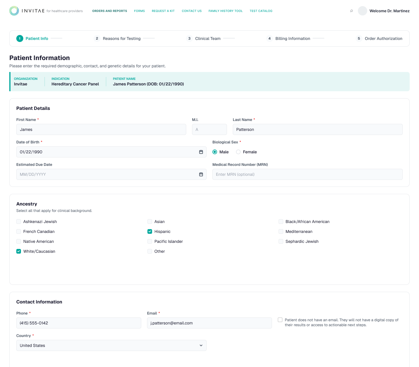
Providers had a habit of leaving incomplete form fields to just get through the ordering flow. Our goal was to adjust that behavior and encourage providers to fill out complete information about the patient, including their email.
In addition to implementing required field states in the form, an email toggle was designed to signal the importance of including the patient's email. If toggled off, providers could omit an email, but were explicitly taking on the route of hand-holding their patient through the entire testing process. Provider behaviors revealed that hand-holding was far more intrusive to their own day-to-day than allowing the patient to take more ownership of their health journey.
Stage 2 — Unblocking the patient
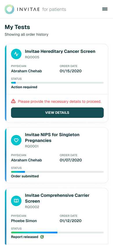
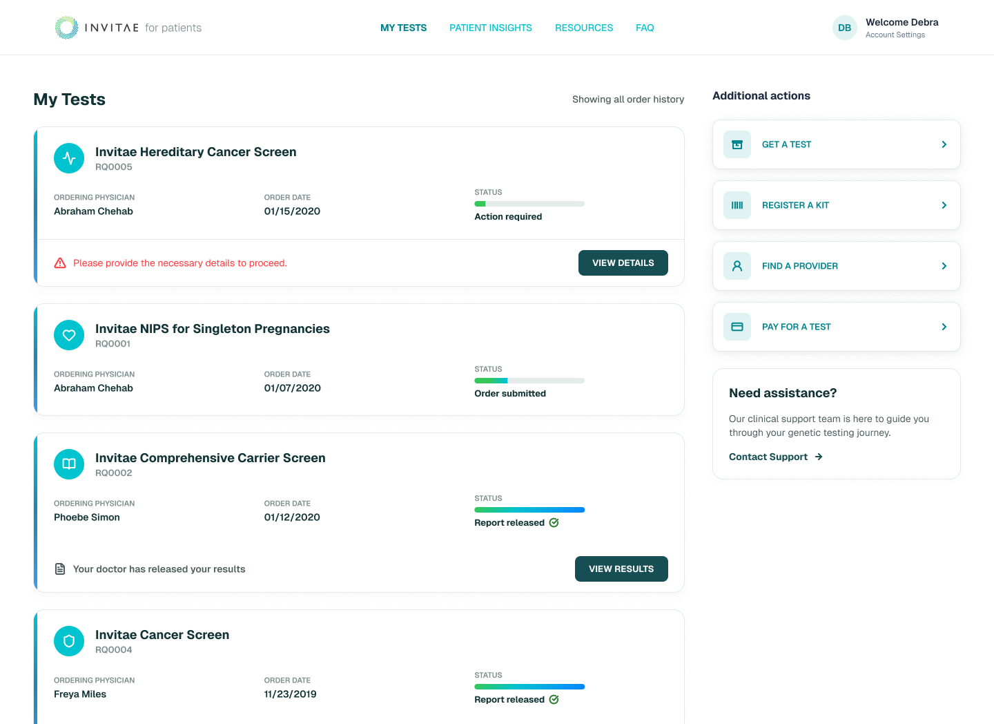
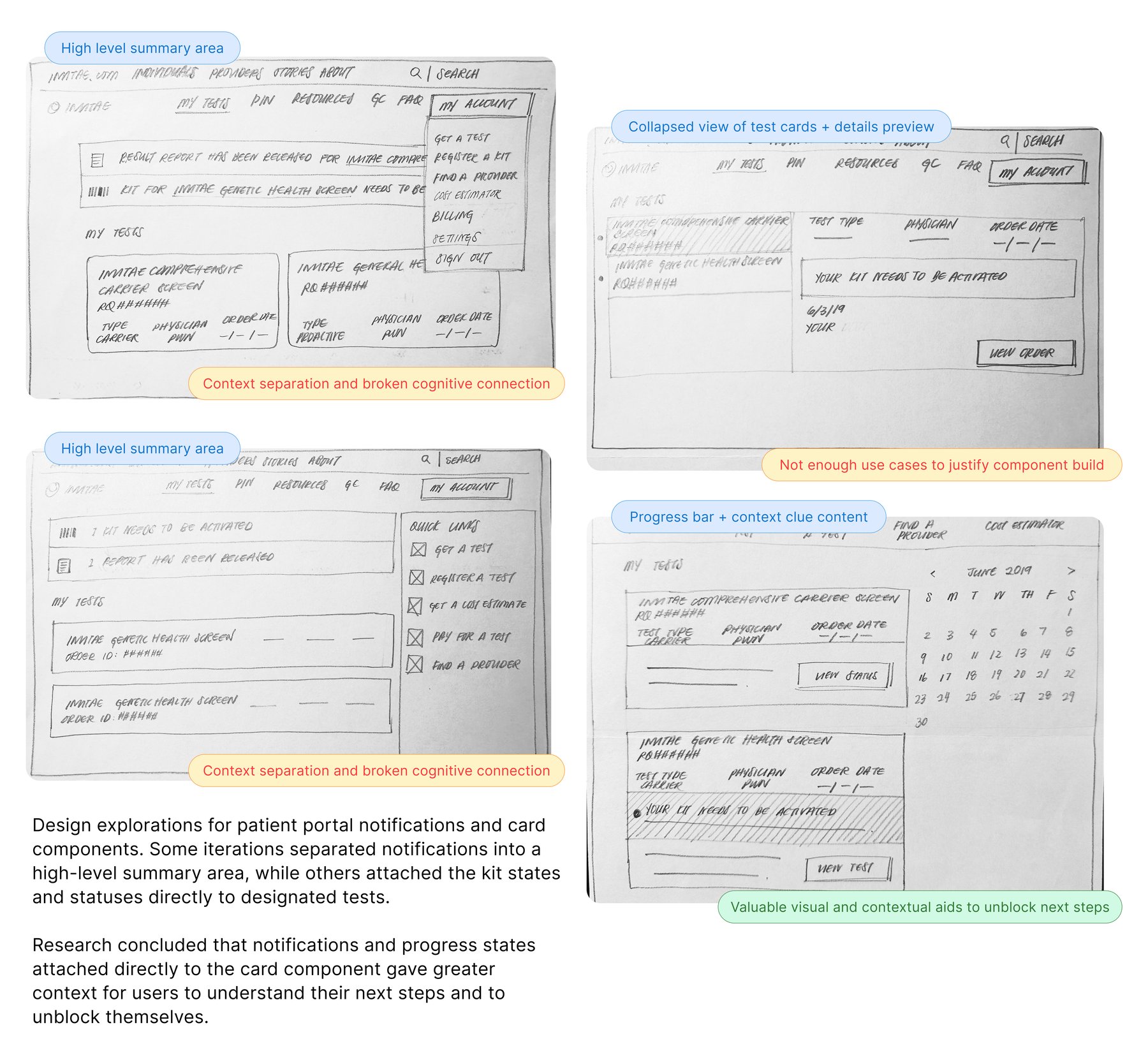
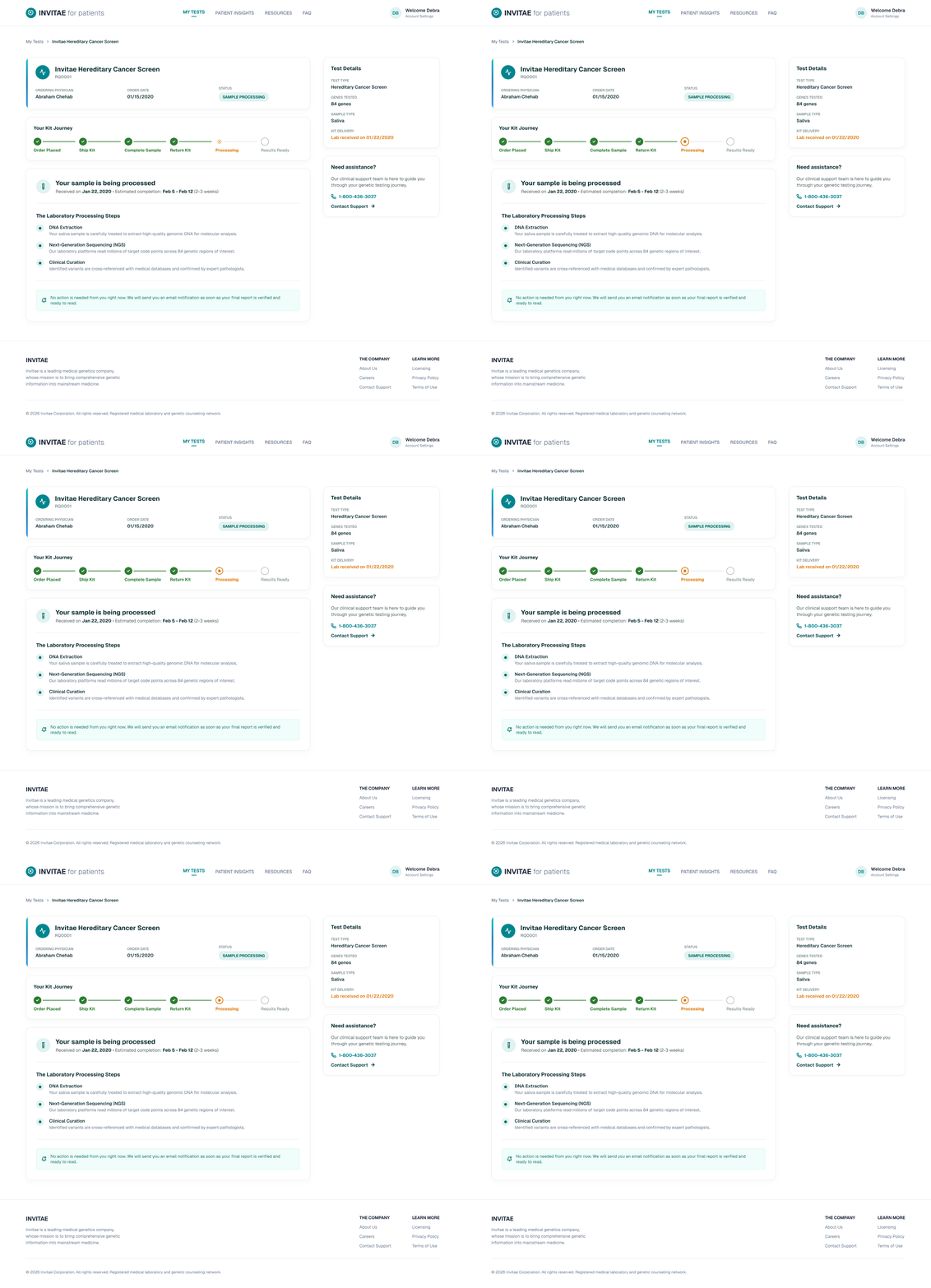
Once the patient could access their account, tests ordered by their provider were displayed on their dashboard. I redesigned the test cards to show a status progress state alongside clear instruction on what was missing to complete their order.
Stage 3 — Activation status in the admin portal
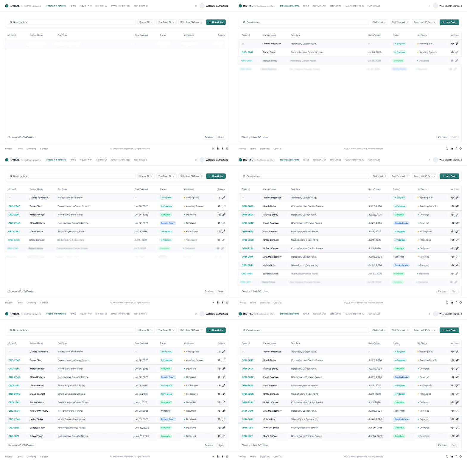
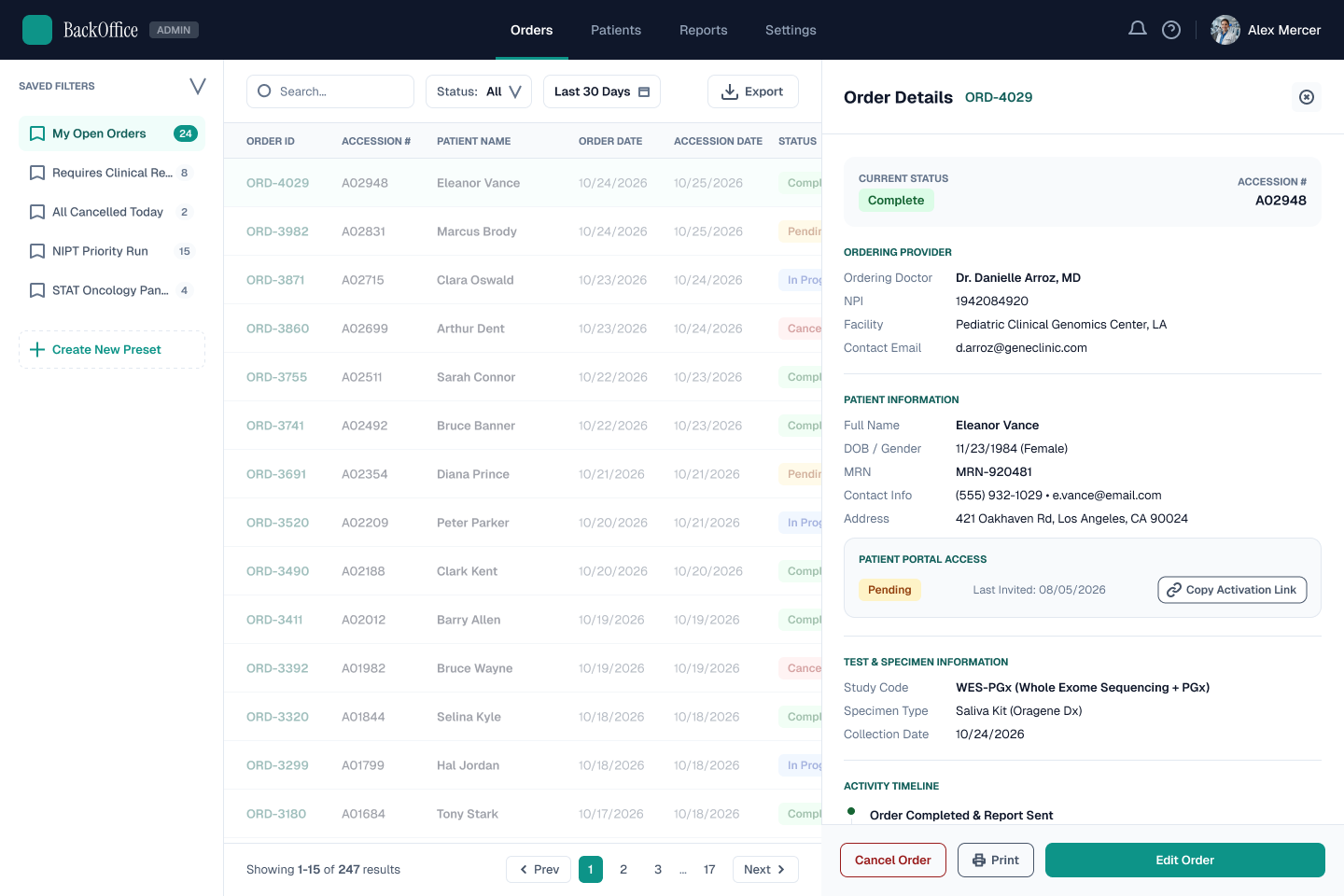
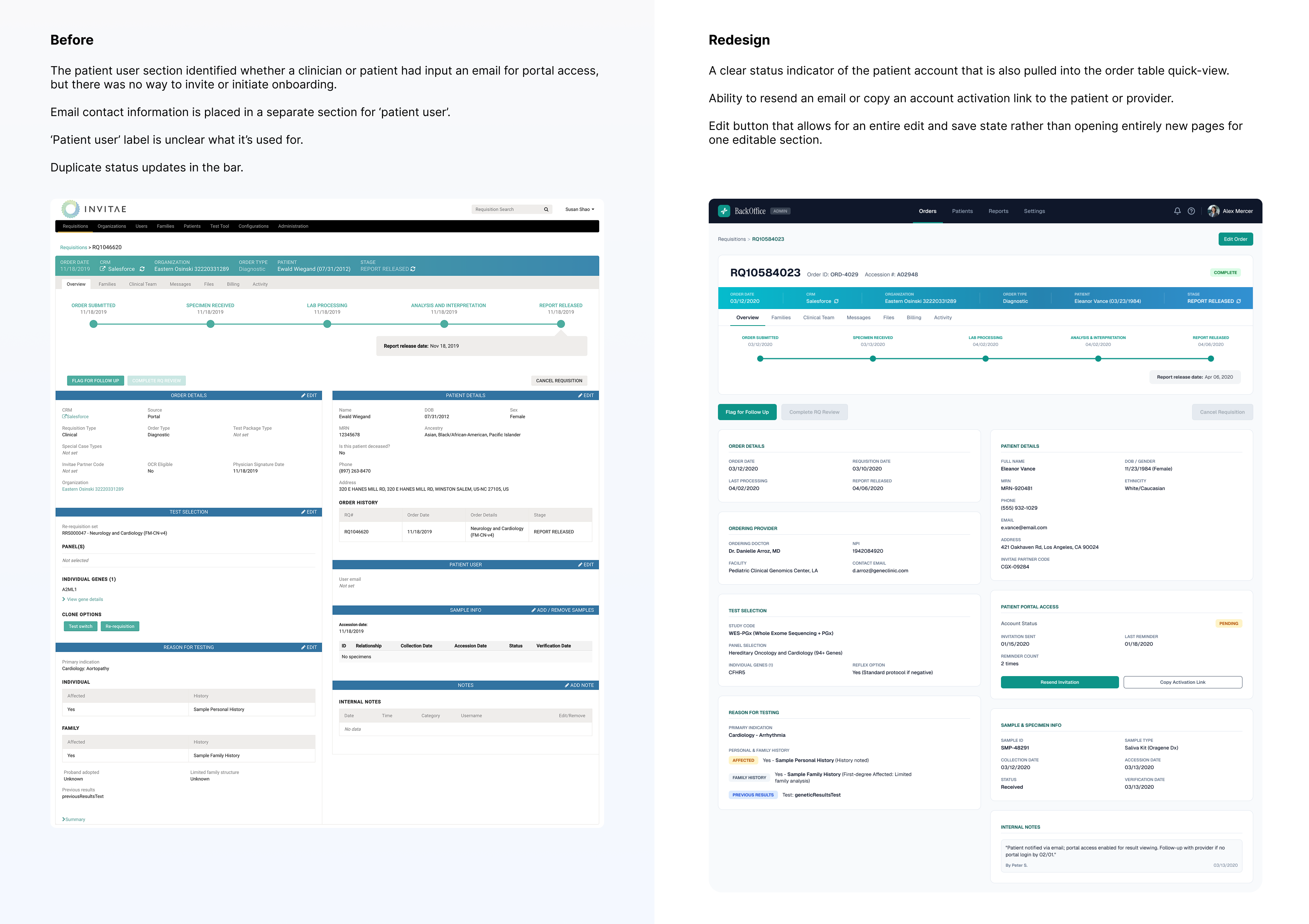
The internal team at Invitae fielded frequent calls from providers asking for status updates on kits ordered for their patients — it was a tricky workflow to trace where an order actually stood. I designed a visible cue for internal members to identify patient portal activation: each order-detail page now had the ability to edit or input an email and create an activation link for patient onboarding.
The internal team could now filter for inactive accounts, monitor the hand-off from provider order to patient portal activation, and take preemptive measures.
Results
Patient and provider conversion rates for health and order intake increased significantly.
The redesign of the cards received positive feedback — the importance of pairing content with a progress state clarified what next steps patients needed to take to receive a kit or their results. The internal BackOffice admin team could now pull reports on patients missing valid emails or who hadn't activated their accounts.
What I'd do differently
These three platform solutions were evaluated and designed over the course of 14 months. I would have liked to see these pages work in tandem earlier, to pull accurate data on how the features improved patient account creation — individually and together.
I'd also be curious to see continued usability testing on the activation-link creation. The design solution gave our internal team an additional task to be wary of, even if light — but giving our patient users more confidence and autonomy would be the next goal.