Building a DSM from scratch
Built Genomic Life's first design system from scratch as founding designer, turning scattered brand assets and PDFs into a single source of truth that let design and engineering move in sync.
The problem
Genomic Life had no digital product experience yet, and no shared design language. Documentation lived across scattered PDFs and email threads, which meant every new feature risked reinventing patterns that already existed elsewhere — slow for design, inconsistent for engineering, and hard to scale as the product grew.
I led the design system build end-to-end, sourcing typography, defining color and component standards, and establishing the interaction patterns engineering built against.
What I built
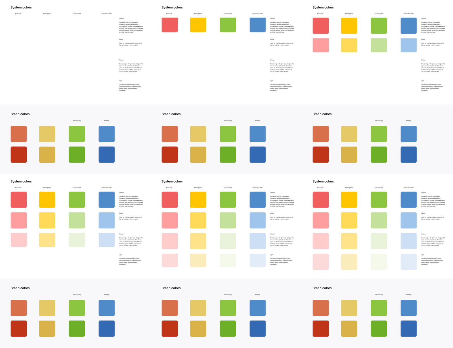
Brand materials
Brand into system. I adapted Genomic Life's existing brand materials — colors, a newly sourced sans-serif typeface — into a working set of UI guidelines, choosing system-state colors for accessibility and contrast rather than just visual appeal.
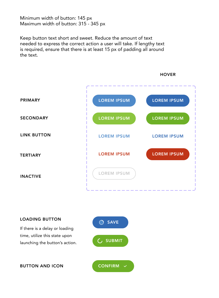
Interactive elements
Components with context, not just specs. Early versions of the library showed components and padding but no guidance on when to use them. I added usage context to each component after seeing design and engineering interpret the same button differently in practice. That gap was the real problem, not the visual spec itself.
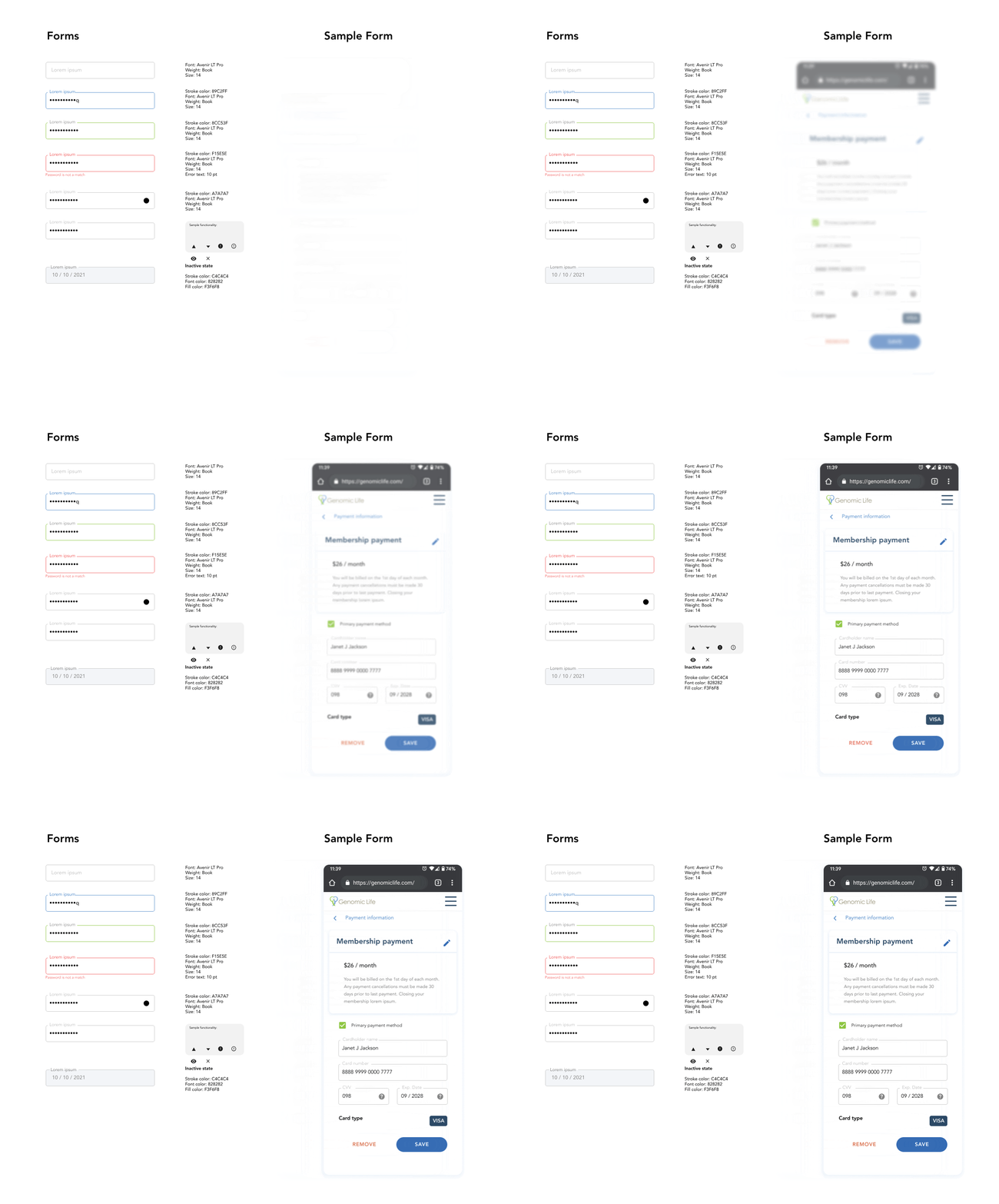
Forms built for a regulated industry. Health-data forms needed more precision than typical patterns. I iterated closely with engineers on spacing and hierarchy, and built reusable templates — like credit card and shipping forms — that could flex across breakpoints without a redesign each time.
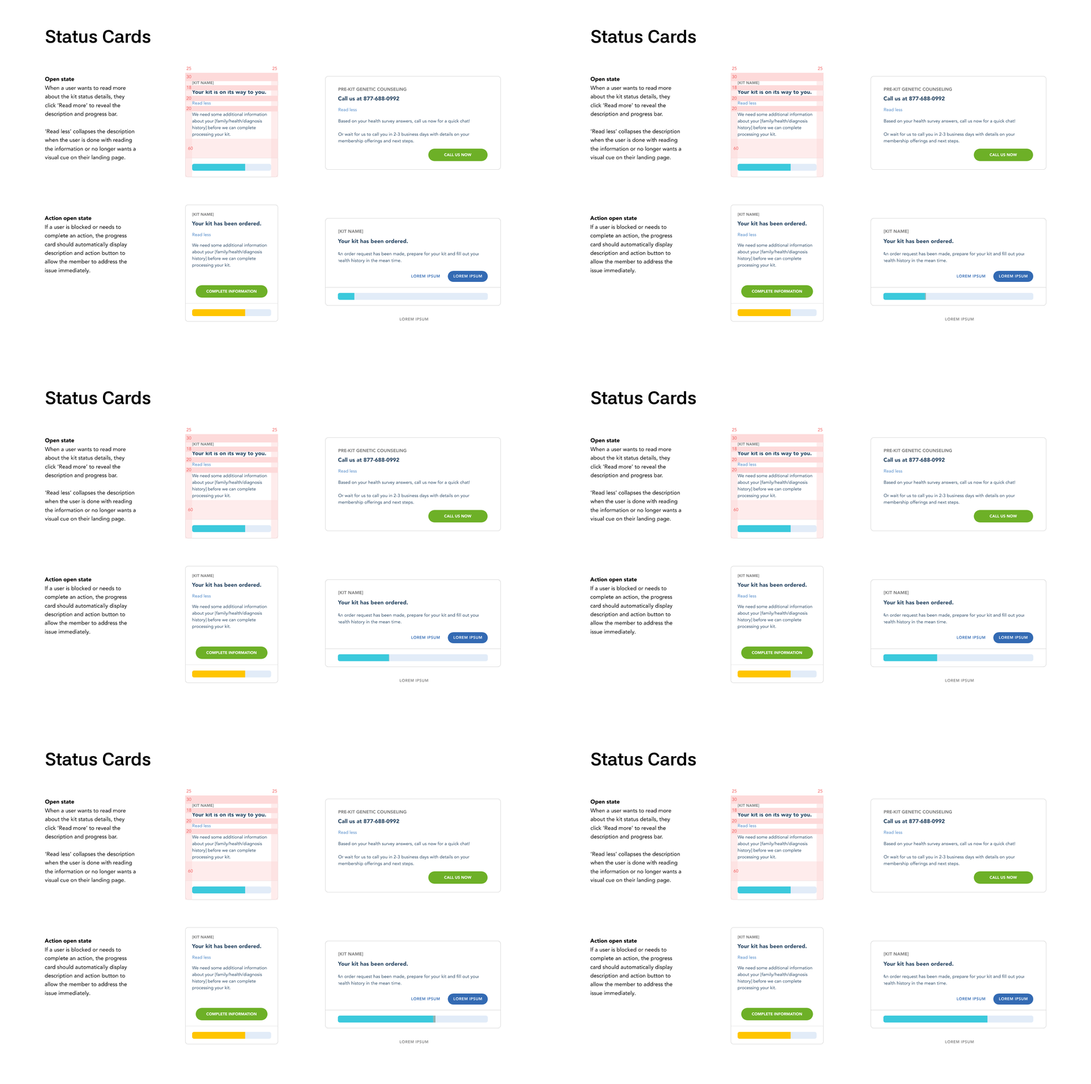
Progress states in detail
I discovered during evaluative research that status updates also needed clear and concise content for users to take next-step actions. Status bars and snack-bar content with detailed instruction and clickable items alleviated persistent questions from our users and allowed our customer service team to focus on edge cases that required invasive troubleshooting.
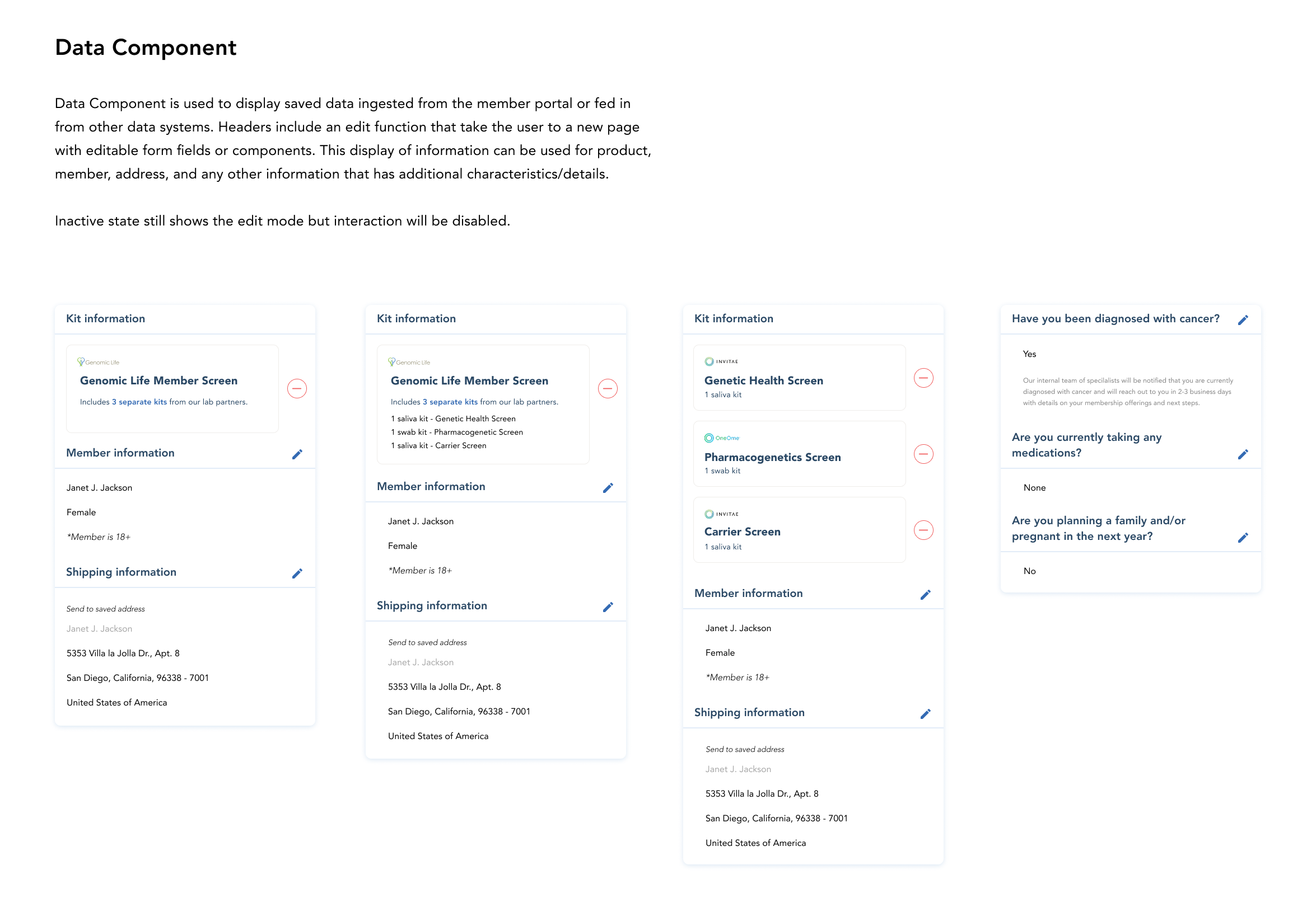
Editable vs. locked data
Some fields — like address — were user-editable; others, like legal name and date of birth, were locked for compliance and only changeable through internal admin. I designed the data components to make that distinction obvious to the user, rather than leaving them guessing why a field wouldn't save.
Results
The design system replaced scattered documentation as the team's single source of truth. The library scaled with the company: as web and mobile experiences expanded, new components were added against established patterns instead of built from scratch each time.
What I'd do differently
I'd bring engineering into naming and structuring conventions even earlier. Some of the edge-case misalignment I found later — like mismatched button usage — could likely have been caught sooner with a tighter feedback loop from day one.
I would implement prototypes utilizing Figma Make to demonstrate interactive design in a concise and meaningful way. This would benefit presentations and consistency of component interaction rules.