Photocoagulator GUI
Laser eye treatment, refined. From seed stage to production, a team of three built a GUI to introduce a new way to interact with an archaic optic medical device.
Project
Our team faced a few core challenges: selecting an appropriate GUI color scheme for the device, building features for technical practices newly introduced to the optometry community, and testing voice-activated user interfaces. Most user research was conducted by the client team, while our team concentrated on product development and design, iterating and testing prototypes with a diverse set of users before launch.
Process
Research & analysis
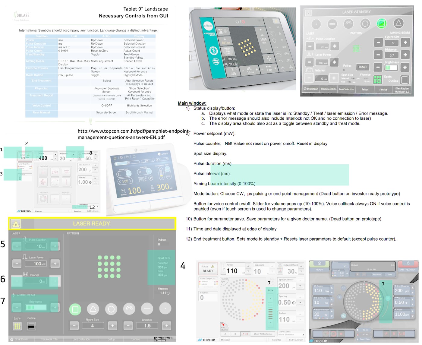
Market research and competitive analysis of similar systems guided initial design brainstorms — collecting information about what users were used to, what we could improve upon, and what features were used during treatment. Comparing systems side by side let us define important primary functions and distinguish them from secondary, nice-to-have features cluttering the interface. These insights shaped persona backgrounds, workflows, and user journeys.
User interviews & observation
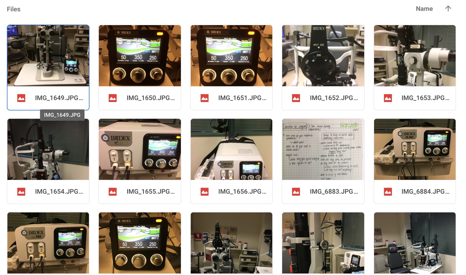
We visited users and observed their current habits on competitor systems to identify pain points and needs that couldn't have been surfaced remotely, giving us a broader perspective on how environmental factors change the way users interact with a system. A shared repository for interview data — observations, videos, notes — eliminated assumptions and increased efficiency during brainstorming; clients could focus on new insights and felt more inclined to contribute to design reviews.
Workflows & personas
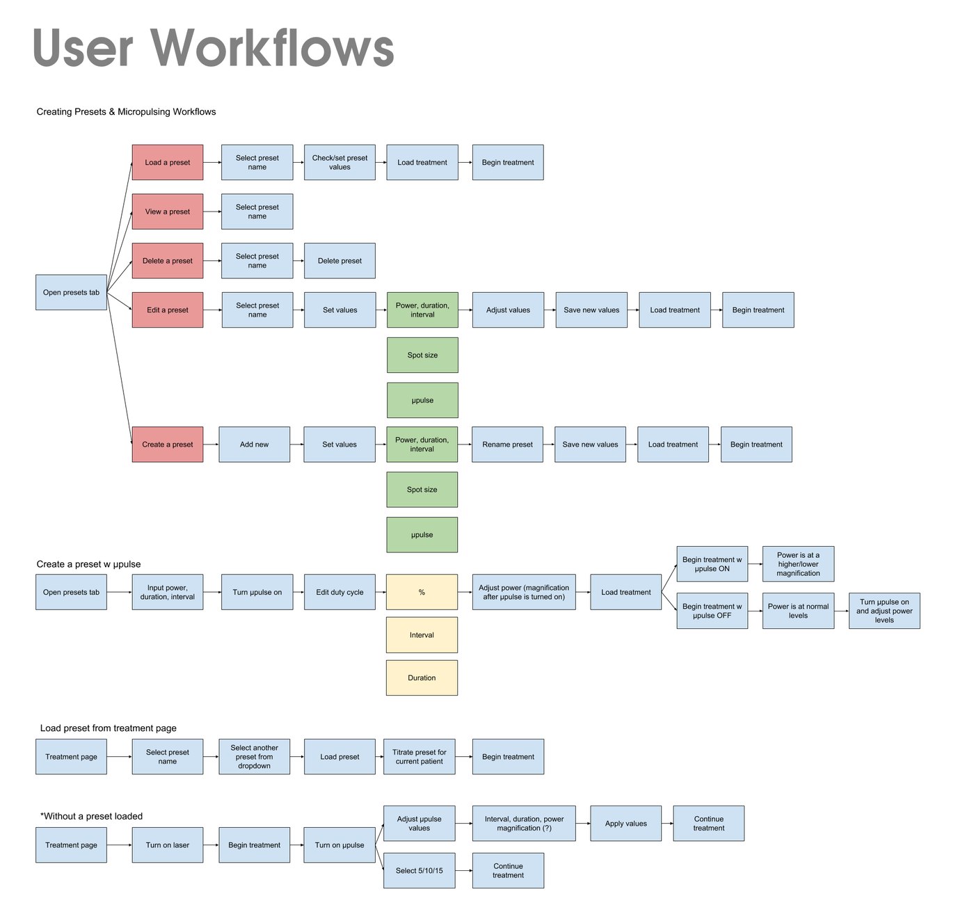
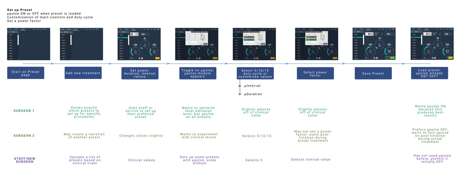
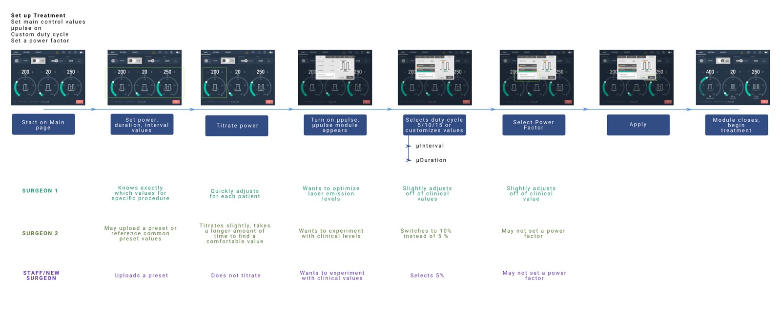
For many system features, we had to understand the clinical workflow and surgical tasks that would define how the user interacted with our product. Building workflows and mapping journeys framed our goals for each task and guided design decisions. Three main personas anchored our discussions throughout — the goal was to address both the familiar veteran user and the likelihood a new user would become a returning one.
Sketch, iterate, wireframe, iterate
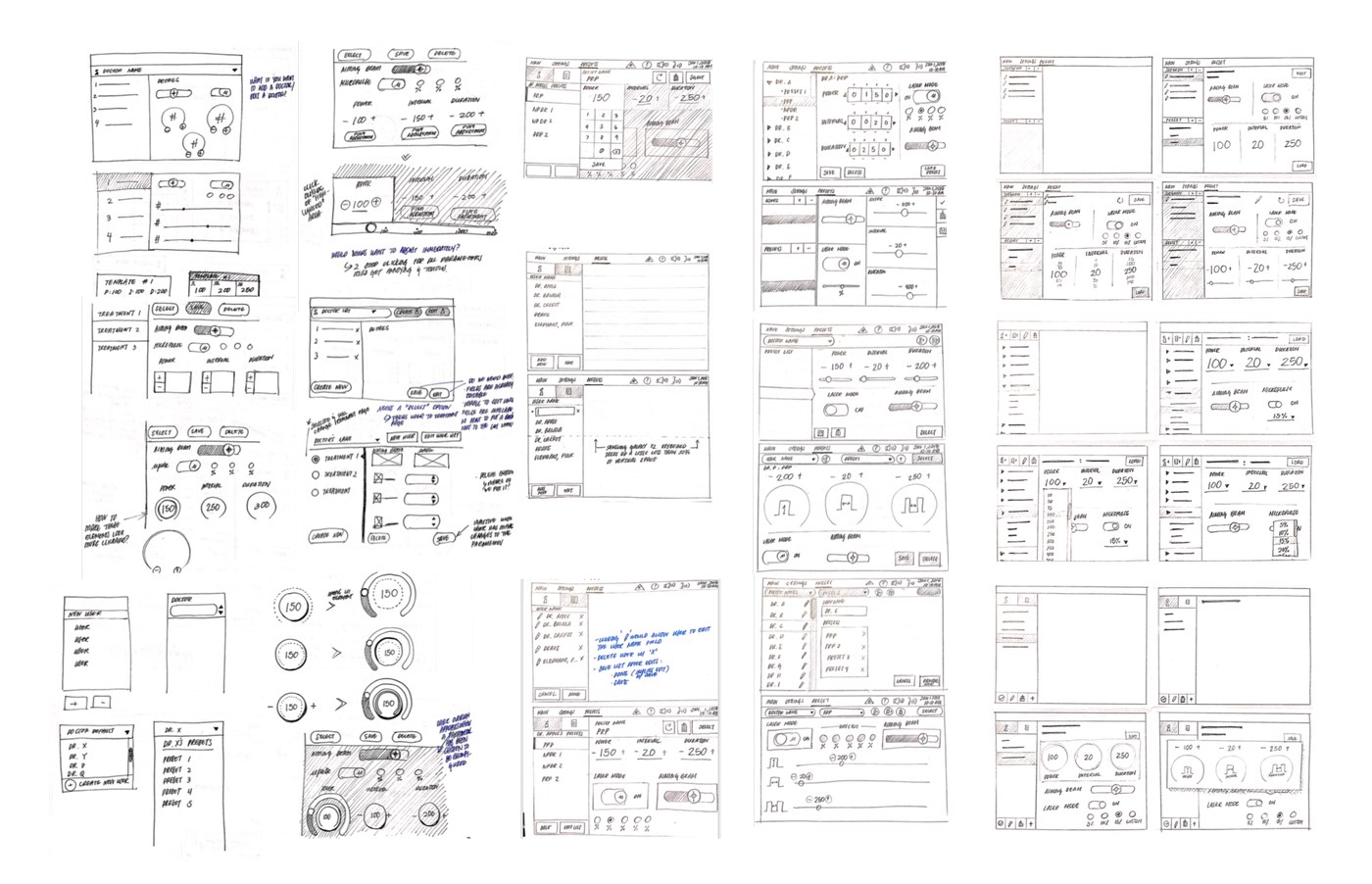
Multiple rounds of iteration uncovered a product-transition issue: no matter how flashy or new our GUI screen was, users would not adopt a new system that took too long to learn. Screen interactions that strayed too far from the original physical controls were heavily pushed back on and would render a prototype useless. Whether it was primary laser controls, voice controls, or treatment presets, the process required a steady cycle of brainstorming and scrapping ideas over nine months.
Prototype testing
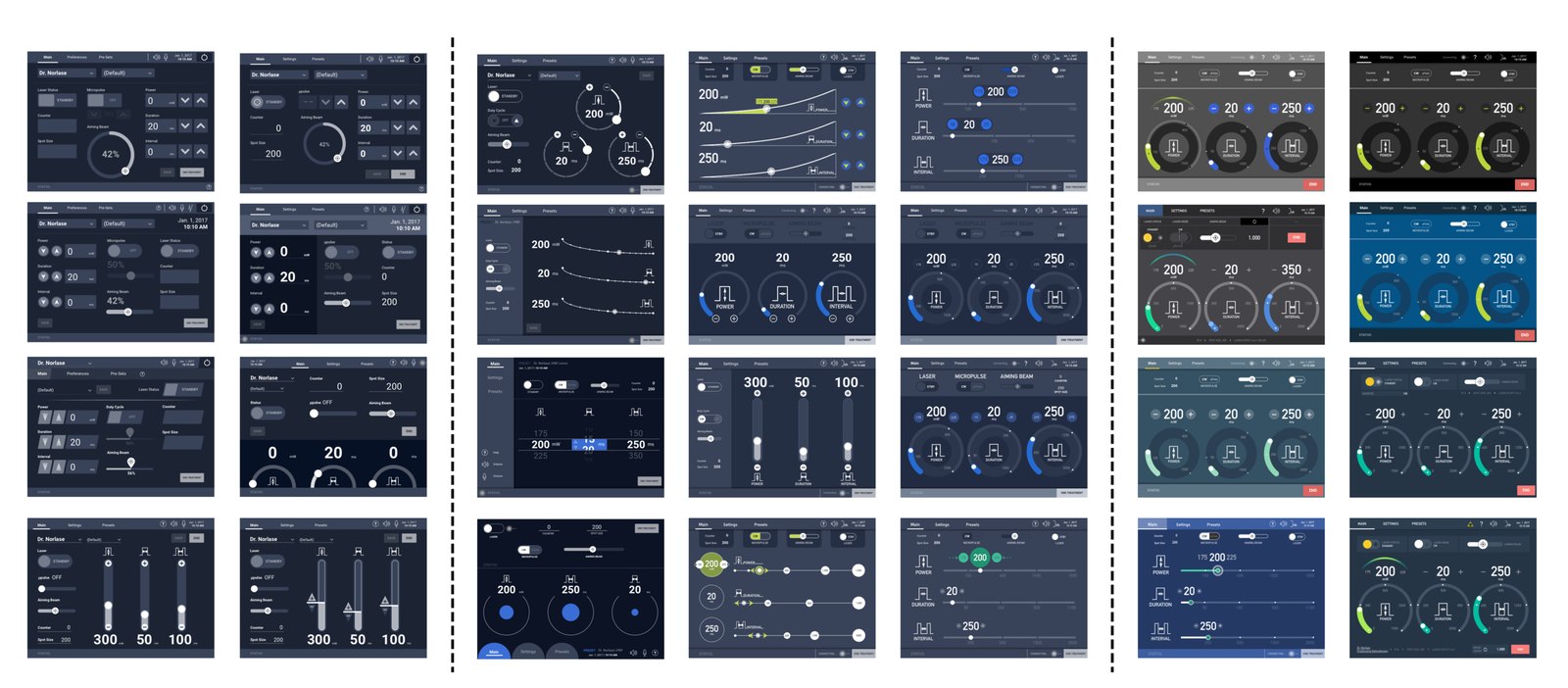
From paper prototypes to software simulations, we put UI screen ideas in front of users early and throughout the process, shaping our information architecture, the fluidity of interactive elements, and the overall GUI color theme. Voice command let users stay hands-free and eyes-focused on treating the correct anatomy — testing a diverse group of users with a functional prototype helped bridge a new model of interaction with a medical device.
Results
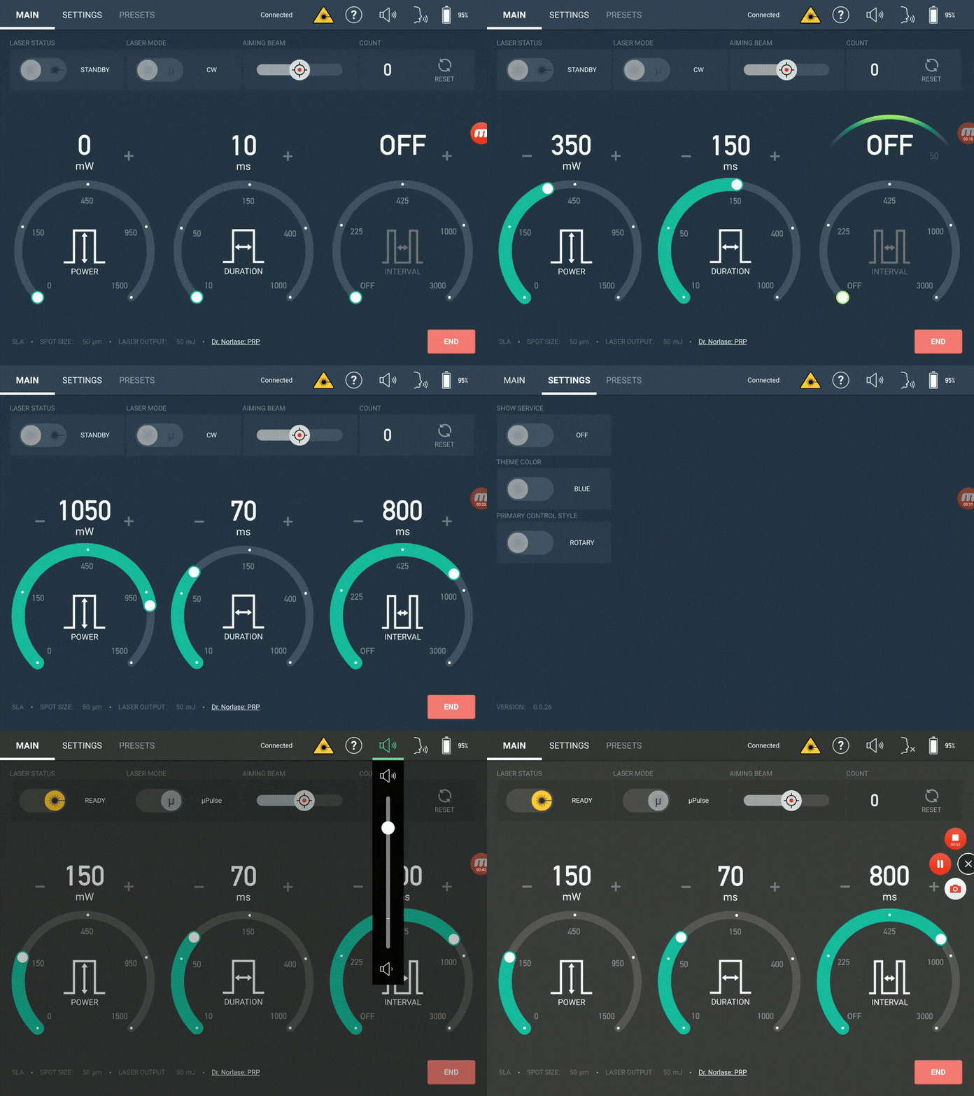
Our client successfully launched the product to clinical researchers and surgeons who use the system in their clinics to optimize laser eye-surgery treatment. The touchscreen GUI gave the product an edge over many competitors already on the market, with continued testing and adjustment based on ongoing user needs.