Result delivery with agent assistance
A flexible settings system that let providers triage genetic test results and delegate routine communication to Gia, a virtual assistant.
Project
A virtual assistant called Gia was introduced to Invitae's services to support providers and patients throughout their genetic testing journey. The team focused on helping providers streamline result delivery, ensuring patients understood findings and the necessary follow-up actions.
Reduce the amount of time skimming documentation to focus on real patients — encouraging the use of a virtual agent and internal support to help care for healthy patients.
Key pain point
Result release to patients had become a cumbersome part of the provider's workflow. Providers were the gatekeepers of every result type — positive, negative, and carrier status — and individual result review consumed significant time.
Process
I examined how providers typically released and discussed results with patients, identifying knowledge gaps around triaging patients with follow-up questions when results indicated genetic health concerns. I created a flexible settings component for the provider portal that adapted to both desktop and mobile interfaces — letting novice users quickly adjust delivery preferences while power users kept access to granular controls. Providers could prioritize urgent cases while delegating healthy-patient communications to the virtual agent.
Desktop — reorganizing information architecture
The primary challenge was restructuring the settings page's information hierarchy for report releases. Analytics showed "Amended reports" and "Report settings" had under 4% utilization, so those unused features were relocated below the fold to declutter the interface.
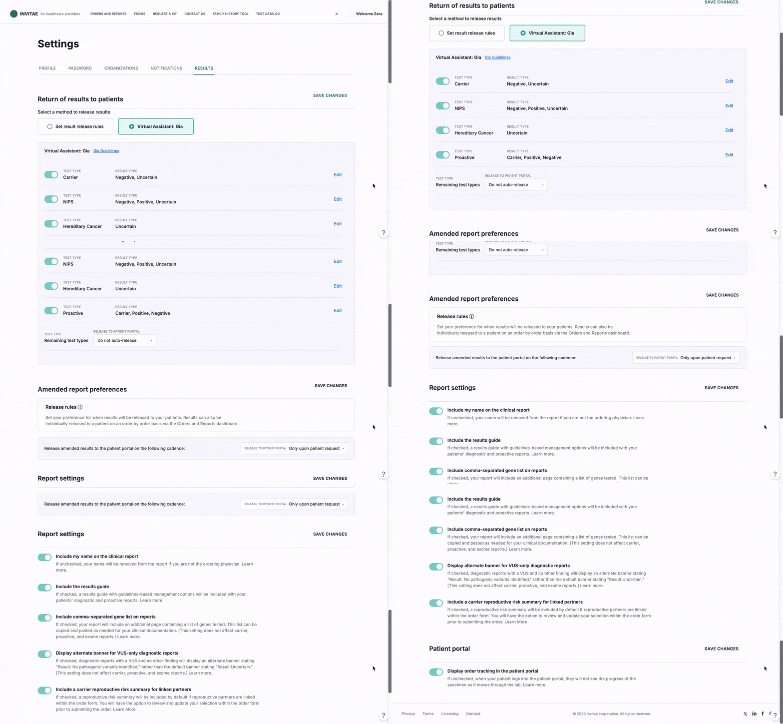
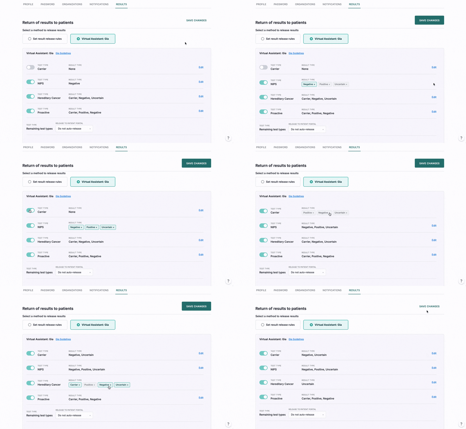
Desktop — prioritizing the virtual assistant
With the recovered space, I introduced options for manual customization alongside Gia integration. Providers manage patient communications differently based on result severity: power users prioritize delivering urgent findings (positive or carrier results) with careful timing, while less critical results (negative findings) don't always require follow-up but can leave patients with complex medical language and no guidance. Some providers preferred delegating sensitive communication to the virtual assistant based on their own comfort level.
Mobile prototype testing
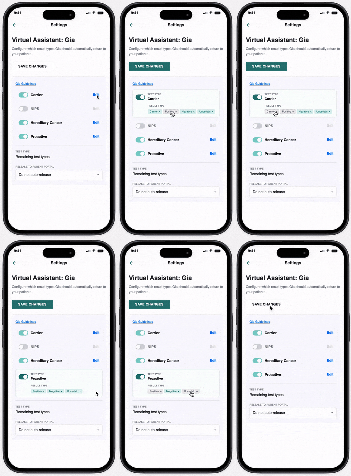
Rather than mirror the desktop layout, I moved Gia setup into its own page flow and hid result-type detail behind an explicit "Edit" state. Providers were mostly desktop-first, but mobile still needed to work without overwhelming a smaller screen with every control at once.
Building Trust with Educational Content
Initial adaptation of Gia required trust. I worked with the Marketing team to produce an easily accessible introductory modal. Utilizing our analytics, we found that the "Gia Guidelines" link was one of the most highly interacted with UI elements on the page.
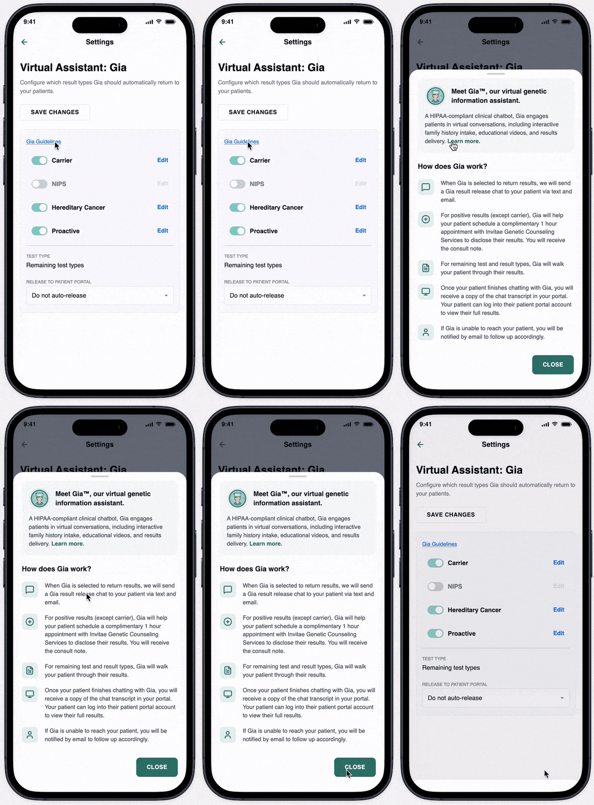
Creating a New Page Instance for Fine-tuning
It was important to make the decision tree clear for our desktop-forward providers. Rather than have a dynamically changing sections like the desktop experience, users preferred seeing a new page keep their focus above the mobile page fold.
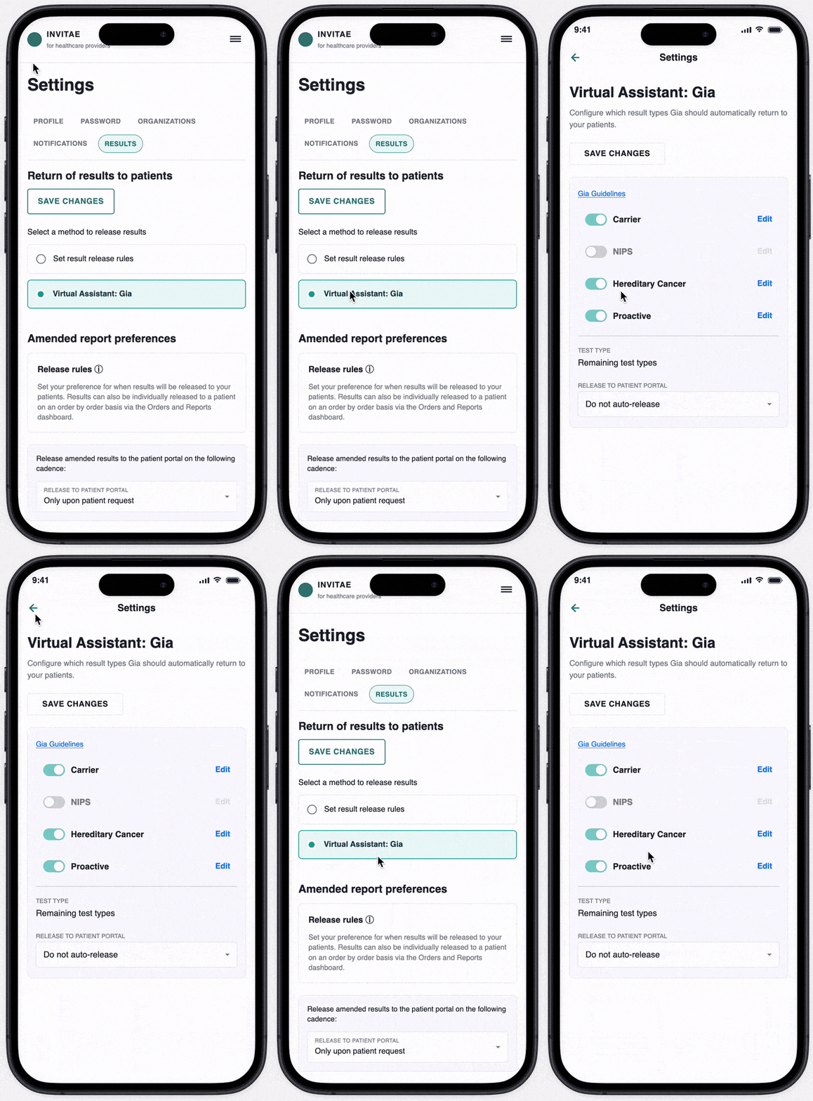
Hidden Result Types & Selection
To reduce clutter and over-use of text on mobile, I created a dynamic version of the component to reveal result types only within the "Edit mode." This followed the principle to help the provider focus on one task at a time within a smaller screen experience.
Based on interview research, providers preferred the order to be based on scientific findings and severity of the result type, with most urgent results at the beginning of the list.
Results
Gia became the primary tool for releasing negative results across all test offerings, with default settings enabling negative and indeterminate/inconclusive releases. Follow-up testing with eight mobile and ten desktop providers found that all participants restricted Gia to negative results only — feedback indicated the knowledge base felt insufficient, though providers expressed interest in expanded future use.
The longer-term vision: Gia supporting remote consultations, recording critical information from virtual interactions, and enabling information sharing between patients and providers, with additional content and action-plan testing to shape its broader impact.